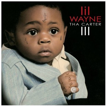
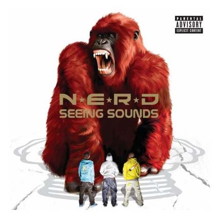
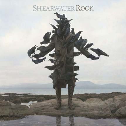
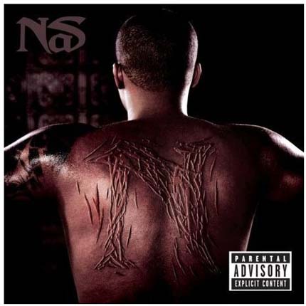
In today's Independent on Sunday legendary album cover designer Peter Saville has pronounced that album art is dead.
Saville is famous for the iconic artwork of New Order and Joy Division who he worked with extensively, he has also designed album covers for Pulp, Suede and Roxy Music.
“We have a social disaster on our hands,” he said, speaking from his studio this weekend, “The things that pop music was there to do for us have all been done... there's nothing to rail against now.
“When I was 15, in the North-west of England ... the record cover was like a picture window to another world. Seeing an Andy Warhol illustration on a Velvet Underground album was a revelation ... It was the art of our generation ... true pop art.”
But is Saville really only speaking for his generation? After all most 15 year olds in the North-west of England today won't be aware that they're missing out on Andy Warhol's artwork, as it's available to view in the mass media and on t-shirts in Afflecks Palace. The rate at which most 15 year olds in 2008 are consuming images in the media is beyond anything Saville would have dreamed of as a teenager in Manchester.
Is the artwork of bands to be consumed elsewhere, rather than packaged around a 12 inch disc of black plastic? Will classic album artwork of the future be all the surrounding marketing of an LP, its TV advert, its website, its promo videos?
Or will the 5cm squared artwork included on your iPod when you view the album details of your favourite tune be all there is left, a postage stamp size footnote of music history?
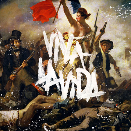
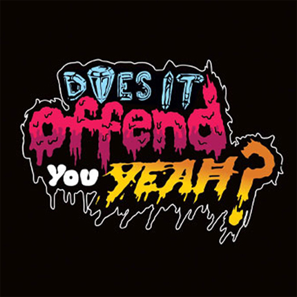
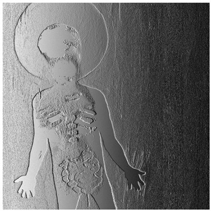
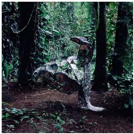
For now, album artwork is still alive and well. To prove my point, here's 10 album covers from this year that manage to encapsulate the sound of an album with imagery. Check 'em out and if you don't agree or you want to suggest something better then leave a comment.


