

More about: Take That
See it on Gigwise now...
Take That have unveiled the cover for their forthcoming album, 'Progress', which is due out next month.
The artwork, shot by US photographers Nadav Kander, depicts the band going through the process of evolution.
'Progress', released on November 22, is the first Take That album in 15 years to feature Robbie Williams.
The record was recorded in New York with producer Stuart Price and is preceded by the single 'The Flood', which was given its world premiere earlier this month.
Meanwhile, Take That are widely expected to announce details of a reunion tour, which will take place in the New Year.
Optical Illusion Album Covers

Animal Collective: Merriweather Post Pavilion (2008) - The inspiration for this gallery, avant-garde indie types Animal Collective have served up a head fuck of an album cover with this. Brilliant.
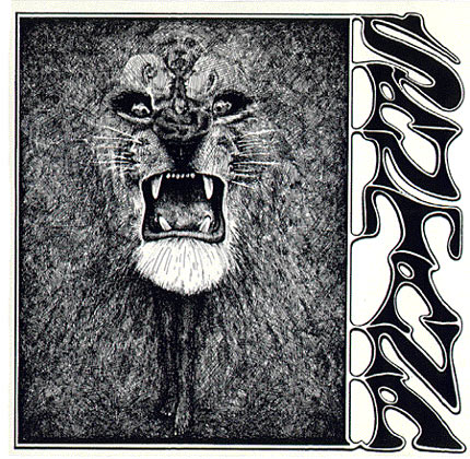
Santana: 'Santana' (1969) - The guitar legend's debut album at first simply looks like the head of a lion. Study it more and it reveals a boy and a further four human heads.

Traffic: 'The Low Spark Of High Heeled Boys' (1971) The rockers have utilised one of the simplest, but most effective optical illusions of all time. Which side is the front of the cuboid?

Def Leppard: 'Retro Active' (1993) Designed by Nels Israelson and Hugh Syne, the big question is whether its a woman at a dressing table or a skull? Or both? The pair took inspiration from Charles Allan Gilbert's 1892 sketch 'All Is Vanity'.

Soulwax: 'Any Minute Now' (2004) Close up, this Trevor Jackson design simply looks like white dots on a black mesh. Draw away from it, however, and it cleverly reveals the album title and band name.
Soulwax: 'Nite Versions' (2005) The Belgian's remix album a year later incorporated the same idea, but with a different pattern.

Styx: 'The Grand Illusion' (1977) The Chicago rockers decided to play on the eyes of the public with this release from over three decades. The figure on a horse defies the perceived space between the trees.

Spiritualized: 'Let It Come Down' (2001) - What looks like a 3D image of a girls face, is actually far from it. The album box is actually a concave carving, but the girls face jumps out at you and moves. Better seen in the flesh, it's a phenomenal design.

Andrew Gold: 'What's Wrong With This Picture?' (1976) The solo artist claims that there are a massive 32 things wrong with this picture â%u20AC%u201C we challenge you to spot them all!
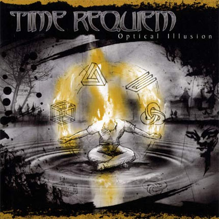
Time Requiem: 'Optical Illusion' (2006) Seemingly in a bid to support their album title, the Swedish progressive metal band have included four classic optical illusions on their album sleeve.
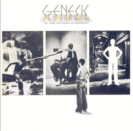
Genesis: The Lamb Lies Down On Broadway (1974) A blatant optical illusion, but this doesn't make 'The Lamb....' any less memorable.
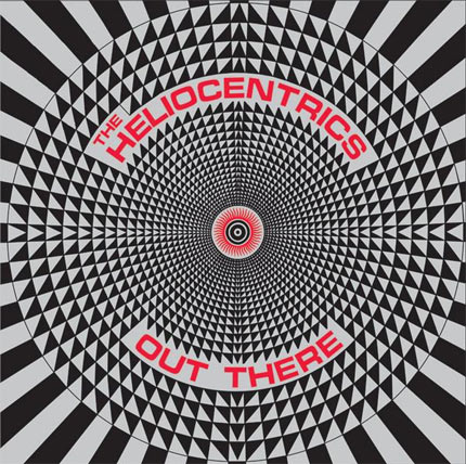
The Heliocentrics: 'Out There' (2007) - Just like Animal Collective, if you stare at this for a while it starts to make your eyes squiffy.

Pink Floyd: 'Ummagumma' (1969) On first impression the sleeve shows a series of mirrors reflecting the same image over and over. However, when you look closer you realise the band members switch positions on each mirror image.
More about: Take That