


Alongside the music and their image, a music act's logo can very much define who they are and give them an easily recognisable identity which fans grasp hold of. Here we look at our top 50 iconic logos of all time featuring an array of acts including Metallica, Aphex Twin, The Who, Slipknot, Led Zeppelin, Kanye West and Prince. Click through and see who makes number one!
CLICK HERE to see the 20 Worst Band Logos Ever!
Featuring Radiohead, The Ramones, Kiss and more...

50. Daft Punk - Designed by Guy-Manuel de Homem-Christo, the Daft Punk punk-patch logo found its way onto all three of their record sleeves with the help of some crafting and re-designing. Speaking in an interview about the symbol, one half of the duo explained its importance; "To us, the Daft Punk logo should be the star -the concept is to keep us more low-profile than the music itself."
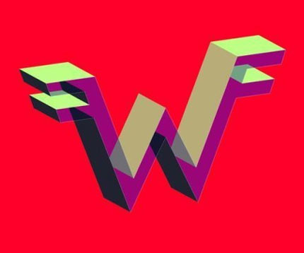
49. Weezer – Our favourite Weezer logo is the one lifted from 'Pork And Beans' – a development from the original in 1992 for 'The Blue Album'. The logo is created by Weezer's very own drummer, Patrick Wilson, and has since remained iconic and loyal to the Weezer name. Some claim it to be a carbon copy of the Van Halen logo, one you'll see on our list later

48. The Cramps – When your musical direction is psychobilly horror-punk, you need a logo to match and with frontman Lux Interior's design we got that. In fact, the logo directly ripped off the lettering used on the bimonthly EC Comics series 'Tales From the Crypt.' It may not be very original but we like it.

47. Whitesnake – This glorious Whitesnake logo didn't last as long as some of those in our list, but it clearly deserved to. How the metal-heads decided to neglect the simplistic, Jim Gibson-designed snake-text in favour of a dull batch of generic metal text remains a mystery. The twists, turns and tangles in the snake's body are more than pleasing to the music fan's eye.

46. Mayhem – The most controversial black metal outfit of all time naturally need a hardcore logo. Complete with upside down crucifixes, bat wings and dagger-like lettering, aesthetically it's as cruel on the eye as their music is on the ear – something we're sure they set out to achieve.

45. Iron Maiden – What you see is what you get; Iron Maiden's metal print band-name is as striking and hard-hitting as their music. The letters' arrangements are reminiscent to a V-shaped guitar, something with the band wouldn't be afraid to use themselves and even though the band have gone on to display more complex images in their site, this remains the best of them all.

44. Bad Manners – Parodying the Michelin man, Bad Manners, with the help of David Farren, gave the mascot a dark side and a new personality to boast. The clever old-skool cartoon design wasn't enough to get the band sponsored by Michelin to earn money to make more records but it still made a mighty impression among the fans.

43. Slipknot – Although Slipknot's image is best known for scary masks and nothing else, this blood-stained logo still has a reputation of its own. On the brink of the release of their fifth album, 'All Hope Is Gone', the tattoo and shredded text remains a little part of the Halloween-inspired nu-metal-heads identity.

42. Kanye West – The bear had featured in all of our favourite arrogant rapper's album sleeves before 'Graduation' anyway, but it truly came to life with the help of this cartoon design. And if ever artwork played a part in album sales. Some believe that Kanye outsold 50 Cent in their famous chart war last year simply because the cover was nicer to look at than Fiddy's. A far-fetched claim, but slightly believable.

41.The Offspring – Designed by Alan Forbes in 2000, the famous, flaming skull logo looks worthy to be seen on the back of biker's jackets everywhere, but it may be a little too colourful for that task (not to mention the dubious quality of the band's music). Equally as colourful is the punk outfit's pop-punk music, it's a perfect marriage.

40. Tool – One of the cheekiest and most innovative designs in our list, the prog-metal four-piece's clever adaptation of a spanner not only showed clever references to their name but it also had a sneaky fallice-feel to it, genius. Perhaps not raising as much controversy as it could have because it was so damn funny, Tool got away with it and we all loved it.

39. Black Flag - If you call yourself Black Flag why don't you go out and make your own flag that's better than any international country's flag a thousand times over? That's exactly what Greg Ginn and co. did with the help of Raymond Pettibon in 1978, three years before their debut album and Black Flag were ready to build a reputation with the help of this "less is more" flag.

38. Van Halen - The rockers' extravagant yet stylish method of guitar solos and general audacity was drafted into one simple logo that became iconic over the years of VH's reign as a mighty cult act that'll never be forgotten. This metallic-edged image was designed by Dave Bhang in 1978 and it's a Van Halen logo that remains popular and memorable to this day.

37. Thin Lizzy - The sharp, stylish letters could be classed as similar to Iron Maiden's rock-out gem, the hard-rock sound was equally similar, let's just assume than Thin Lizzy got there first. One of the most timeless logos in our chart, it remains cool to this day. Amazing how most bands that can blow a few amps can blow a few minds with their symbols.

36. Crass - The punk rock band's lyrics and actions in were gutsy when it came to both music and publicity. The logo was critical not just of Christianity but also the military, a couple of the many things the punk anarchists didn't like about "the system". Offensive and outrageous, that's sometimes what makes logos iconic and fantastic.

35. Emerson Lake & Palmer - Puzzled with what to do with such a wordy band name, a then 33-year H.R.Griger reduced it into a simple ELP and arranged the shapes of the letters harmoniously in this highly balanced, simple design. Keith Palmer was so impressed with the work that the band decided to use it on their 1973 album 'Brain Salad Surgery.' The rest, they say, is history.

34. Anal Cunt - As if Anal Cunt's band name wasn't offensive enough to some, their logo is an even more sure-fire way to spark controversy. Designed by Chris Broduer in 1988, the use of minimalism (replacing the "u" in the band's name with an asterisk) to sum up the concept behind Anal Cunt, their music and what they stand for is done perfectly in this attention-grabbing logo.

33. Inspiral Carpets - Manchester's beloved Inspiral Carpets came up with this cow logo after Clint Boon took several photographs of cows on a farm, later to be projected in the background of their live performances. The "cow-movement" then developed into a cartoon image of a spun-out, drugged-up cow which stands out as one of the most fun in Gigwise's top 50. Another version of the image can be seen with a cow smoking a spliff and wearing black shades, titled "cool as fuck."

32. The Strokes - As if the sleeve for 'Is This It' wasn't iconic enough, the Strokes then went on to unveil this disco-inspired glamorised logo. Its sqeaky-clean feel could be described as the complete opposite to the band's edgy sound, most notably on their debut record. If you ever buy a Strokes t-shirt, you need one with this on it. The logo even made a cameo in the Transformers movie.

31. The Specials – Many believe Madness stole the idea of having a man in a suit as a logo from the Specials. The gentleman in question, dubbed Walt Jabsco, can be seen in various positions, strutting various dance moves. Designed by Jerry Dammers and Horace Panter, it's a glorious illustration that sums up the ska genre perfectly.

30. New York Dolls – The band's subtle sex appeal was summed up perfectly with this smeared chrome lipstick symbol, wound around the surface of what would be an invisible mirror to our minds. It helped promote the idea of boys wearing make-up, an idea which had been fiddled about with by a few acts previous – Elvis included. But the New York Dolls made it cool and that's what makes this logo so important.

29. Aerosmith - Although former guitarist and co-founding member Ray Tabano was only with Aerosmith for a year and didn't even have any involvement in writing material, in designing their ubiquitous logo his input to the band is crucial. It has been tweaked slightly in recent years, but importantly the wings, trademark A and jellied Aerosmith lettering al remain.

28. Bad Religion – Religious controversy usually comes about the most when a popular film or book includes an insult to Christianity but Bad Religion stunned the masses with their cross-through-a-cross, iconic logo. Designed by Brett Gurewitz in 1980, the logo is regularly compared to the Crass logo, made in a similar vein of anger, but this simpler version of the debate-raging image stands up as the more iconic. Just.

27. Guns N Roses - Although the delay for upcoming record 'Chinese Democracy' is making us all forget about what Guns 'N Roses actually sound like, at least we can remember what they stand for thanks to the beautiful design that accompanies their record sleeves. The symmetrical formation of two guns and two roses stand out in the forefront of the band name and it's definitely easier to look at than the sleeve for 'The Spaghetti Incident?' and even a picture of Axl Rose.

26. Madness –Similar to something you'd find on a looney-tunes cartoon next to bugs bunny, this simple black & white shape formed to look like a man in a suit sums up Madness brilliantly. Designed by Bubbles, it oozes style and class as well as giving those buying a Madness record a direct impression of what they sound like without having to hear a single song; traits that make a truly great logo.

25. Bauhaus – Why Bauhaus were originally christened Bauhaus 1919 is a difficult thing to get your head round; as is their ubiquitous logo, until you look at it carefully. David J Haskins' delightful morphing of the human face is an impressive optical illusion and although it's not the most instantaneous of our logos, it's one of the most impressive.
24. Jurassic 5 - Like a doodle that came to life, Jurassic 5 gave their team initials a whole new meaning with the calm and chic design from member Charlie "Chali 2na" Stewart back in 1997. Featured on their self-titled debut LP, their alternative take on hip hop became infinitely cooler with the help of this symbol, merging the J and the 5 in perfect harmony.

23. Dead Kennedys - Another act to design a logo on the basis of their initials, the "Dks" made the most of their nickname with the help on Winston Smith in the late 70's with this stunning spear-headed symbol. As the Dead Kennedy's popularity moved onwards, the symbol went with them, wherever they went on tour, graffitied on the back of gig venues where they played by loyal fans.

22. Jamiroquai - Band frontman Jay Kay may be irksome, yet you can't fault his genius 1993 Buffalo Man logo. Basically a silhouette of himself wearing one of his infamous hats, it's a lasting image. If only Jamiroquai's music had the quality to match.

21. Queens of the Stone Age – Joss Homme and co.'s contact-book got them far when regular Kyuss producer/engineer Patrick Hutchinson generously offered the band one of the most intelligent, iconic logos of our time. The sperm-into-egg image was cleverly morphed into the letter Q, the first syllable of the band's name and has been used since 'Songs For The Deaf' was released back in 2002. The subtle beauty of it even makes it immune to controversy.
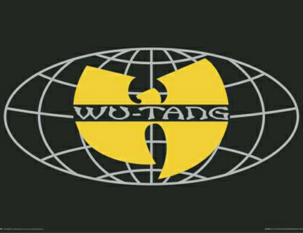
20. Wu Tang Clan - The hip-hop megagroup's logo is instantaneous and memorable. The mysterious bird shape is simplistic and stylish, it could pass as an auto-shape on paint, but it'll remain lodged in your head from the very first time you lay eyes on it. The fact that it was emblazoned on millions of teenage hoodies in the nineties makes it even more poignant.

19. Metallica - Taking the angular, blade-like shapes from the 'M' and 'A' in James Hetfield's famous lettering design, this logo may look like a highly dangerous martial arts weapon, yet it's also a startlingly brilliant and easily recognisable design.

18. The Grateful Dead – Although artist and long-term Grateful Dead collaborator Bob Thomas designed the skull and ray design back in 1969, it wasn't until it was used for the cover to 1976 live album 'Steal Your Face' that it became wholly synonymous with the band. The original working version only included the flash, with the skull added later.

17. The Sex Pistols - Just like the band themselves (well, back in their seventies heyday at least), Jamie Reid's 1977 logo is rough and coarse. Basically a collage of letters as if torn from a newspaper, it perfectly echoes a ransom letter while at the same time summing up the band's DIY ethos. Brilliant.

16. Nine Inch Nails – Consisting of the letters 'NIN' mirrored perfectly, the simple but devastatingly effective Nine Inch Nails logo was designed in 1989 by Trent Reznor and the band's art director at the time Gary Talpas. It's claimed that the pair took their inspiration from the lettering on the Talking Heads album 'Remain In Light', although we can't really see it. Impressive image though.

15. Misfits - The iconic skull-face dates all the way back to 1946, originally intended for the movie 'The Crimson Ghost' by Russell Kimball and Fred Ritter. The minimal art print is beastly and cheeky, similar to yhe Misfits' music. It'll make you shake in your boots for eternity. The fact that this logo made over 60 years back can still be seen on teenager's t-shirts everywhere around the globe is an impressive thought.

14. Aphex Twin - Featured on the iconic 'Xylem Tube' sleeve and of course on the umbrellas in the infamous Windowlicker video, the Aphex Twin 'A' logo is sheer genius. It's easy to draw comparisons between this and the experimental movement that lurks about on Richard James' innovative music. Apparently influenced by alien myths and other such tales, Paul Nicholson's masterpiece gives leeway for someone to make an entirely new alphabet of the same mysterious lettering.

13. Prince - The purple midget's 'Love Symbol' sums up everything that's great about our favourite little guitar hero: sex appeal. After using it on his album of the same name, the logo became so popular that Prince adopted it as his new name for a short period of time to annoy his record label. The diamond-encrusted logo you see here is a developed version of the original made in 1992, and it\'s our favourite.

12. AC / DC – Amazingly, Gerard Huerta who forged the lightning strike logo in the mid-seventies, based the lettering design on one he had made for Blue Oyster Cult a few years earlier. It soon became firmly entrenched with Oz rockers. We particularly like this electronically charged version.

11. Public Image Ltd. - Like many of the great logos on this list, Public Image Limited utilised an incredibly uncomplicated image that was successful because fans could easily copy the design and emblazon it on themselves or their desks at school. Basically their abbreviated name PiL and contained within a pill, it is simplicity defined.

10. Public Enemy – An enduring image of a man in the line of fire, the logo is as legendary and iconic as the rap group themselves. The silhouetted man at the centre of the gun sight is actually LL Cool J's sidekick at the time E Love, while Chuck D himself actually drew the image. A pretty talented guy, then.

9. Kiss – Unlike most other logos on this list that were designed by external sources, Kiss' iconic design was forged by none other than band guitarist Ace Frehley for their 1973 sophomore album 'Hotter Than Hell.' It stuck and Kiss have used it ever since. While some knock the logo for being unimaginative, you can't deny that it's striking and effective.

8. Hieroglyphics - The influential hip-hop outfit are best known for thinking outside the box with their ideas and talents, so naturally their band logo is a clear example of that. The three-eyed freaky face design was snapped up by the collective and is even worn by the band members themselves on band t-shirts, badges and stickers. The fans too fully embraced this gloriously simple image.

7.Yes – This logo is the third Yes design by famous artist Roger Dean, who previously designed much leaner versions. The chunky lettering and fun nature of the logo makes it completely memorable and the one that features most on the bands' releases. The logo above is one of a whole string of psychedelic variants Dean has made over the decades.

6. HIM - Designed by frontman Ville Valo on the day of his 20th birthday, the Heartagram with its combination of a heart and an inverted pentagram represents love and hate. Many HIM fans have heartagram tattoos, while Valo has shared the licence of the design with skater Bam Margera who uses it on his skateboards and other merchandise. In an interview with MTV, Valo joked that the logo is more famous than the band it represents - we'd hasten to agree with him.

5. Led Zeppelin – Based on a 1869 sketch of Greek god Apollo by William Rimmer called 'Evening Or The Fall Of The Day', the image was actually designed to represent Led Zeppelin's own record label Swan Song which was set up in 1974. Coupled with the band's trademark font, the logo's iconic status was cemented when it appeared on memorabilia and T-Shirts which you still see on the street today.

4. Radiohead – Designed by long-term Radiohead collaborator Stanley Donwood together with Dr Tchock (aka Thom Yorke), the wired looking bear was a mainstay of the Oxford band's merchandise and a firm fan favourite throughout the early noughties. Although it never appeared overtly on any of their album sleeves, the bear was completely synonymous with Radiohead; the sign of a great logo.

3. The Who – The first logo was designed by Brian Pike back in 1964 with the two letter 'h's merged to create a feeling of unity and the arrow on the 'o' was meant to signify an uplifting edge. Ahem. Alongside the Union Jack one, the 'target' version above was one of the defining interpretations of the design.

2. The Ramones - The take on the Seal of the President, but switched with the band members' names, was created by Joey and Dee Dee's long-term friend Arturo Vega. Instead of an olive branch, the eagle bares an apple tree branch as in Vega's words the band are as "American as apple pie", while the arrows were replaced by a baseball bat. Vega was inspired to make this iconic design after seeing them perform in Washington DC where he noted they were the "ultimate all-American rock band."

1. The Rolling Stones – Put simply, there isn't an album logo as iconic and easily identifiable as pop art Rolling Stones lips and tongue. Designed by John Pasche in 1971 it originally appeared hidden away on the inner sleeve to their 'Sticky Fingers' album, yet it's inclusion on Pasche's subsequent artwork and poster designs cemented its legendary status. An unforgettable image.